NFPA 704 Hazard Placards... Can you see them?
I suppose the best way to start this off would be to ask all of you a simple question, do you require residential or business addresses to display the address using a contrasting background? I'm 100% sure that all of you are nodding your head, thinking of course! We have to find the place to be able to do our job.
Well, the same thing goes for NFPA 704 Hazardous Materials information diamonds. I've thought about how to present this information that will enable you to both grasp the concept, regardless of where you may be around the world, and be able to share this information with both your department as well as with your businesses that you inspect when ordering new NFPA 704 Hazmat Diamonds.
First off, take a look at this photo. What's the hazards involved? Can you easily read the information on the NFPA 704 placard?
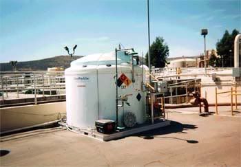
This photograph was taken in the daytime! Shadows interfere with the ability to accurately read the numbers on the placard. Keep in mind that we are not talking nighttime, smoky conditions or other environmental factors that could hamper your ability to clearly see the placard.
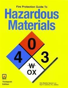
Here's the problem... NFPA who controls how the NFPA 704 diamond is displayed is heavily supported by industry and business. Making a change, requiring everyone to change the standard is costly and not generally supported. I know this first hand. I attempted to make a code change through the NFPA 704 Committee and was turned down. Even the cover of their publications reflect this backwards, money driven decision to stay with the status quo...
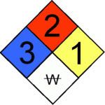
What folks need to realize is that we (firefighters) own the NFPA diamonds. First in company officers make decisions based on the information provided on the 704 placard. Not the NFPA. Let me explain using simple graphics...
Before:
After:
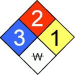
Many companies are starting to get it. Here's a great graphic that shows both the NFPA hazard information as well as using a NFPA Diamond with the contrasting background example:
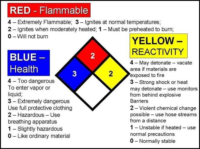
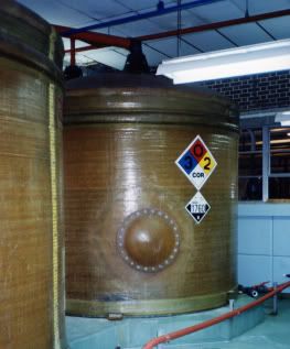
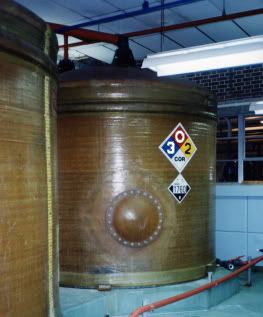
Putting the concept of a contrasting background into perspective, here's a before and after photo of an above ground tank. You make the decision as to which one is more visible!
Finally, now that we are all thinking NFPA Diamonds, did you know that when arriving on scene at a commercial fire, involving hazardous materials that you can make a pretty good subjective decision on the levels of PPE by just looking at the blue health hazard number?
4 = Level A
3 = Level B
2 = Level C
1 = Level D
The red background / fire portion of the placard, regardless of the number tells me that I have potential for something to burn.
The yellow background actually scares me the most... Let's say the business is storing and using a potent oxidizer that requires refrigeration. Loose the cold, have the storage vessel heat up to over 50˚F and the contents will spontaneously detonate. That means it goes boom in a big way and takes you with it...
The only problem here is that you have to be able to see it to use it.
I hope you find this helpful. Stay safe, Mike from Santa Barbara
Well, the same thing goes for NFPA 704 Hazardous Materials information diamonds. I've thought about how to present this information that will enable you to both grasp the concept, regardless of where you may be around the world, and be able to share this information with both your department as well as with your businesses that you inspect when ordering new NFPA 704 Hazmat Diamonds.
First off, take a look at this photo. What's the hazards involved? Can you easily read the information on the NFPA 704 placard?

This photograph was taken in the daytime! Shadows interfere with the ability to accurately read the numbers on the placard. Keep in mind that we are not talking nighttime, smoky conditions or other environmental factors that could hamper your ability to clearly see the placard.
Here's the problem... NFPA who controls how the NFPA 704 diamond is displayed is heavily supported by industry and business. Making a change, requiring everyone to change the standard is costly and not generally supported. I know this first hand. I attempted to make a code change through the NFPA 704 Committee and was turned down. Even the cover of their publications reflect this backwards, money driven decision to stay with the status quo...

What folks need to realize is that we (firefighters) own the NFPA diamonds. First in company officers make decisions based on the information provided on the 704 placard. Not the NFPA. Let me explain using simple graphics...
Before:

After:

Many companies are starting to get it. Here's a great graphic that shows both the NFPA hazard information as well as using a NFPA Diamond with the contrasting background example:

Putting the concept of a contrasting background into perspective, here's a before and after photo of an above ground tank. You make the decision as to which one is more visible!


Finally, now that we are all thinking NFPA Diamonds, did you know that when arriving on scene at a commercial fire, involving hazardous materials that you can make a pretty good subjective decision on the levels of PPE by just looking at the blue health hazard number?
4 = Level A
3 = Level B
2 = Level C
1 = Level D
The red background / fire portion of the placard, regardless of the number tells me that I have potential for something to burn.
The yellow background actually scares me the most... Let's say the business is storing and using a potent oxidizer that requires refrigeration. Loose the cold, have the storage vessel heat up to over 50˚F and the contents will spontaneously detonate. That means it goes boom in a big way and takes you with it...
The only problem here is that you have to be able to see it to use it.
I hope you find this helpful. Stay safe, Mike from Santa Barbara
Tags:
Replies to This Discussion
-
Permalink Reply by turk182 on August 19, 2008 at 2:03pm
-
I found it very helpful I am going to take the chart you made and make a pocket guide for all my fire fighters to carry in their turn out gear. Thanks for the post and the guide.
-
Permalink Reply by Mike Schlags (Captain Busy) Retd on August 19, 2008 at 5:42pm
-
Remind your folks that the ERG is for transportation (DOT gives it away) related incidents. I have to put together some new graphics to do a better job explaining where to direct a business to place these placards. This is a great forum to share information, truly helping out your brothers and sisters. Thanks for your input. Mike
-
Permalink Reply by Mike Schlags (Captain Busy) Retd on August 19, 2008 at 5:55pm
-
As mentioned in my response to turk182, not only do you have to be able to read it but just as important, you have to have accurate information on the placard, representing the maximum hazard inside or outside the facility. I'll be posting an update to this soon but to give you an example, you have three roll up doors in a concrete tiltup commercial. Above all three doors are NFPA 704 placards with all of them displaying a 3-0-0.
Here's the problem, behind door number one is cryogenic nitrogen, door number two chlorine gas and door three has ethylene di-bromide. Nitrogen is a cryogenic. Chlorine gas is a toxic and the EDB is a highly toxic per Uniform Fire Code hazardous materials classifications. But... all three require only the 3-0-0.
Here's the fix: By making use of the special hazards portion of the diamond, you can more specifically identify the hazardous materials. For this scenario, the nitrogen would be a 3-0-0-CRY, the chlorine would be a 3-0-0-TOX and the EDB would be 3-0-0-HTX.
Using the DOT hazard classes, a simple and understandable abbreviation is used on the lower part of the NFPA diamond to identify specific hazards. Fire code dictates that incompatible materials be seperated by specific distances, so this generally means that there are separate areas to be placarded.
Here's the three letter abbreviations for the hazard classes (CFR compliant):
COR - Corrosive Materials
EXP - Explosives
OXI - Oxidizing Materials
TOX - Toxic / Poisonous Materials
HTX - Highly Toxic Materials
OHH - Other Health Hazards
We have the ability to require what ever we want for the special hazards section. Los Angeles City FD for example uses a capital letter "A" to denote that artisian's (artists) are in a commericial building and that there could be a life hazard. Some departments use a capital "T" to denote truss construction. There is no limit to what we want to have placarded. It's all about getting the hazards identified using something that already exists, were just making it better.
Thanks again for your reply. Mike
-
Permalink Reply by Mike Schlags (Captain Busy) Retd on August 19, 2008 at 6:00pm
-
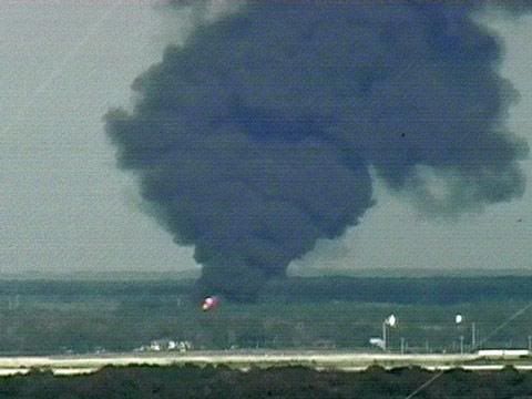
Don't you just hate it when your responding to a reported hazmat incident and you can see the black toxic plume from miles away, all the while, wondering just what kind of nasty stuff you are going to have to deal with... Luckily, the fire prevention division and or engine company doing the facility inspection made sure that accurate NFPA 704 placards were posted at all the entrances and on all the structures to warn firefighters about the specific hazards...
-
Permalink Reply by Mike Schlags (Captain Busy) Retd on August 19, 2008 at 6:18pm
-
I remember visiting the Houston Fire Department Hazmat Team response vehicle years back. I asked them why did they have a pair of tennis shoes in the van? There response was so they could run away faster... One pair of shoes and nine guys... yea right... Thanks for your reply! Mike
-
Permalink Reply by Christopher J. Naum, SFPE on August 19, 2008 at 8:26pm
-
Thanks for the great insights and posting. Maybe enough people can support submitting comments during the next comment period and review cycle to get the committee to address this.
-
Permalink Reply by Brian Dumser on August 19, 2008 at 8:36pm
-
I like the new style. However, placards go hand in hand with pre-incident planning, and knowing the hazards in your district. Stay safe!
-
Permalink Reply by Mike Schlags (Captain Busy) Retd on August 19, 2008 at 8:41pm
-
Hey Chris, This is exactly my intent toward first educating other firefighters and then going back to the NFPA in numbers. The intent of what I am trying to share is so obvious. It's all about our safety here and being able to go home in the morning... Thanks so much for your comments.
-
Permalink Reply by Mike Schlags (Captain Busy) Retd on August 19, 2008 at 8:43pm
-
Amen to that brother! Your preaching to the choir... Thanks for taking the time to comment.
Specialty Websites
Find Members Fast
Firefighting Videos
© 2026 Created by Firefighter Nation WebChief.
Powered by
![]()
Badges | Contact Firefighter Nation | Privacy Policy | Terms of Service